Design and Art Direction
Corteza is a concept panadería in Mexico City. Baking traditional Mexican and French bread daily. Drawing inspiration from Mexico's past it utilizes Aztec sculptures to Celebrate Mexico's roots through its design.
The Logo
Fraunces Typeface

Spanish-inspired Serif Typeface.
Corteza Translates as crust in Spanish.
Corteza Translates as crust in Spanish.
Instagram


Illustrations
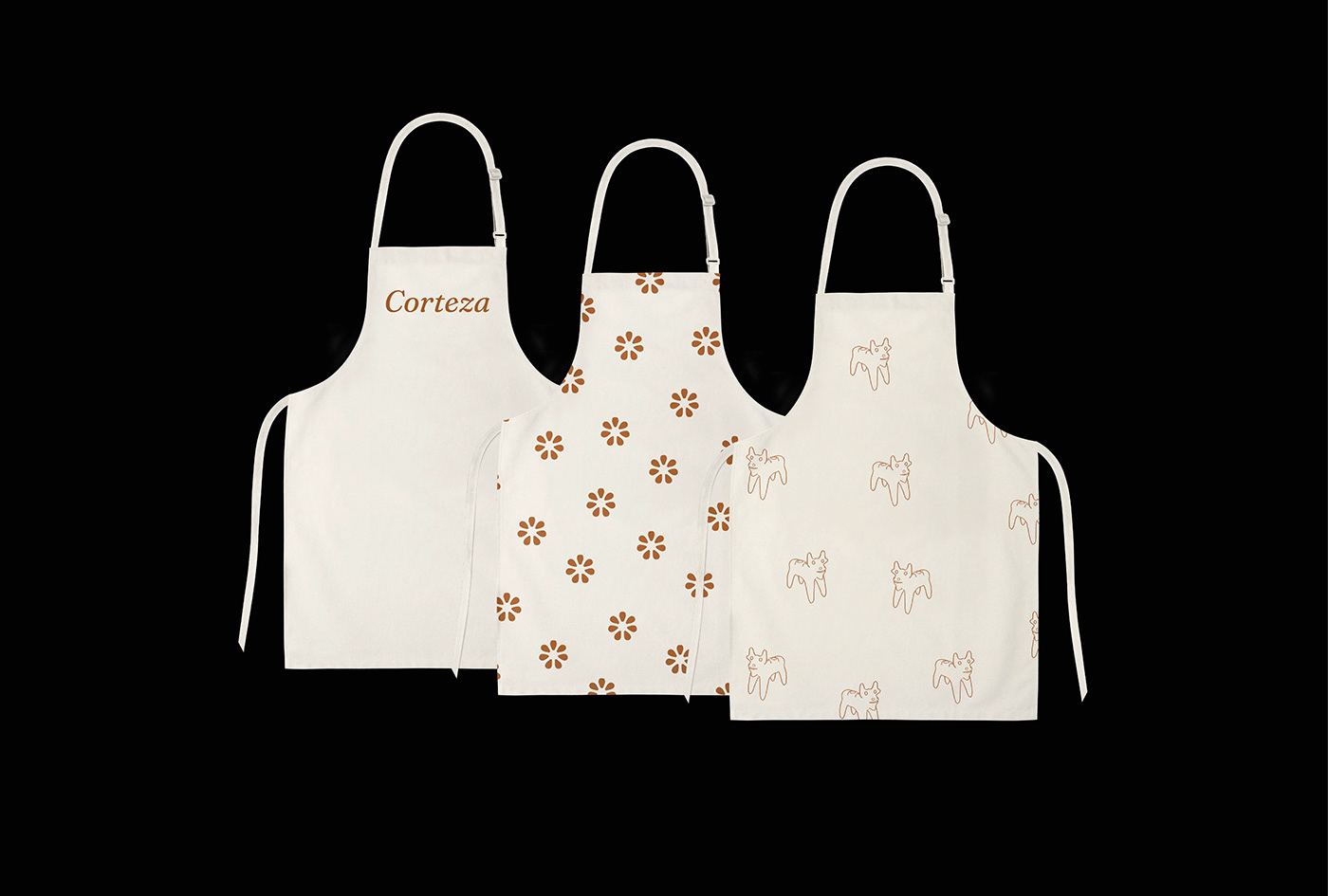
These fun and meaningful illustrations are meant to resemble ancient Aztec Sculptures. Incorporating Mexico’s ancestral past into the branding allows Corteza to celebrate the culture and people of Mexico.


Menu